ShopDreamUp AI ArtDreamUp
Deviation Actions


Description
This is a super basic tutorial that's meant to give a general idea of how to make a comic page. It's in no way professional, and only something someone asked me to do.
READ THIS IN ADDITION TO THE ACTUAL TUTORIAL:
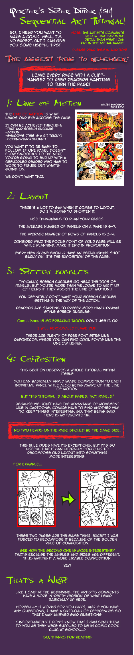
So, I hear you want to make a comic. Well, I'm no expert, but I can give you some useful tips!
The biggest thing: leave every page with a cliffhanger to keep readers WANTING to turn the page
Line of Motion
The Line of Motion is what leads our eye across the page. It can be achieved through text, action, and even shadows. You want it to be easy to follow. If one panel doesn't flow smoothly to the next, you're going to end up with a befuddled reader who has to work to figure out what's going on. We don't want that.
Now LoM isn't always obvious, and sometimes it IS stupid and hard to follow, but if you PURPOSELY make it so, try to make it have to do with the actual rhythm of the story. If something shakes up the characters, make it shake up the reader. I don't advise you try that often though, because frustrated readers probably won't be readers for long.
Layout
The layout of your page will affect your LoM greatly. Thumbnails are great to use to plan pages because they're quick and easy to fix if you decide you don't like something. (Seriously, realizing you have a flow problem early on will save you a lot of grief.)
Speaking of flow, the number of panels on the page will affect it. Fewer panels makes for faster page turning. The average number of panels for a page is around six or seven, which is a pretty even pace if you're including handy dandy speech bubbles. Three rows of panels is pretty average, too. (I'll admit this is my favorite layout, but variation becomes difficult, so if you mix it up more often, you'll find fewer variation issues and more/less space to draw.)
And while I'm on that ramble, you want to focus point of the page to be the biggest panel or image. If the main flipping character is beating the living crap out of his adversary in an epic fashion, why NOT show it in epic proportion!? You want the audience to feel that god dang Falcon Punch just as much as your villain feels it!
Also, every time you change the scene, there should be what's called an ESTABLISHING SHOT. That's the setting, it's what lets your readers know where the heck they are. Depending on how you change the scene, you don't have to have the establishing shot first, but it should definitely show up in one way or another. (Think about a movie. Some scenes have a generic establishing shot of the building. Others may incorporate it into the action with a wide or overhead view of the characters talking.) Regardless of how you do it, make sure it's there.
If you need some inspiration or help, take a look at what other comic artists have done. They're pros. (If not, I don't know why they're in production.)
Speech bubbles
Oh, speech bubbles! As half the focus of the panels (aside from your assumedly BEAUTIFUL artwork), dialogue can be pretty important. The original purpose of sequential art was to tell a story through pictures, but in our world, we like details, and details come mostly through dialogue. But you don't want so much dialogue that it takes away from the story, you want it to assist in telling the story. (So don't put too many words in unless you're a genius.)
Typically, speech bubbles go near the tops of panels, but you're more than welcome to mix it up. (Just make sure it flows with the LoM.) Also, because we (in North America) typically read left to right (unless you're specifically making a manga), your speech bubbles should do the same. And like layout, have the focus point be the flipping FOCUS POINT. If no one can tell what the heck it is, why is it the focus point?!
You definitely don't want your speech bubbles getting in the way of the action of the scene. I've literally tried to look around a speech bubble like a corner trying to see what was happening behind it. Typically you don't want it covering the face (unless it's a composition technique), body language (if it's important), or anything notable in the background that is mentioned or meant to be there as a plot device (For mystery, duh.).
Also, (probably because of Asian influence), readers are starting to prefer more hand-drawn style speech bubbles. I agree with that because if they're done well, they're much more interesting and feel like they have more life to them than computer/template-generated repetitive crap. Just don't make them so small that you can't read the text. On a letter-sized page, 10pt font is usually average. (Maybe 12pt, MAYBE 8pt.) Try to be consistent with font size. You don't have to force it to fit the bubble. (Shrinking it is another thing, but don't make it huge unless someone is yelling.)
As a side note, Comic Sans is mo'freaking taboo. Don't use it, or I will personally flame you. If you're in need of a good font, look at sites like Dafont.com. There are plenty of free fonts that you're allowed to use. (If you need help installing them, Google it or ask me.) And be consistent with your font choice. Don't change it from page to page. If you must, write down what font you used for what part. (I made the mistake of not doing that and ended up flipping between two similar fonts for one part of my comic.)
Composition
This portion has more to do with specific panel compositions. First of all, I advise planning your pages and panels with SMALL thumbnails, and I say small for good reason. When you keep things small, your eyes can see the whole image, which will greatly help you identify any proportion or balance problems you might run across.
When I do thumbnails, I legitimately use semi-stick figures. They let me lay out the panels, movement, and speech bubbles in a simple way while also conveying what's actually going on. And if no one else can tell what's going on in YOUR thumbnails, who cares? They're for your use, right?
As far as panels go as a WHOLE, I've learned something extremely useful in keeping composition interesting. Because we don't have the advantage of movement like in cartoons, comics have to find another way to keep things interesting, so, that being said, here is my favorite tip: no two heads on the page should be the same size. While there are some exceptions, this “rule” literally forces us to find other ways to portray the action, and it's super useful when characters are just talking and nothing is actually being performed. (Sometimes it also forces us to change our layout into something more interesting.) [Cvs.V thumbnail example] Try different angles (Even if you think you can't do it, TRY!) to mix up your pages so you don't just have eight panels of front and profile views of talking characters. That's boring. I would know.
Wrap Up
If you take NOTHING else from this tutorial, take these things:
-Line of Motion and how it works
-No Comic Sans
-6 to 8 average panels, 3 average rows
-Mix the layout up
-No Comic Sans.
-No two heads should be the same size
-THUMBNAILS!
-NO COMIC SANS!
-ESTABLISHING SHOTS
-FOCUS POINT
-NO COMIC SANS!!!
And that's about all. Thanks for reading! If you want a more in-depth tutorial of something, let me know! I've got PDFs galore!
(c)qorter
READ THIS IN ADDITION TO THE ACTUAL TUTORIAL:
So, I hear you want to make a comic. Well, I'm no expert, but I can give you some useful tips!
The biggest thing: leave every page with a cliffhanger to keep readers WANTING to turn the page
Line of Motion
The Line of Motion is what leads our eye across the page. It can be achieved through text, action, and even shadows. You want it to be easy to follow. If one panel doesn't flow smoothly to the next, you're going to end up with a befuddled reader who has to work to figure out what's going on. We don't want that.
Now LoM isn't always obvious, and sometimes it IS stupid and hard to follow, but if you PURPOSELY make it so, try to make it have to do with the actual rhythm of the story. If something shakes up the characters, make it shake up the reader. I don't advise you try that often though, because frustrated readers probably won't be readers for long.
Layout
The layout of your page will affect your LoM greatly. Thumbnails are great to use to plan pages because they're quick and easy to fix if you decide you don't like something. (Seriously, realizing you have a flow problem early on will save you a lot of grief.)
Speaking of flow, the number of panels on the page will affect it. Fewer panels makes for faster page turning. The average number of panels for a page is around six or seven, which is a pretty even pace if you're including handy dandy speech bubbles. Three rows of panels is pretty average, too. (I'll admit this is my favorite layout, but variation becomes difficult, so if you mix it up more often, you'll find fewer variation issues and more/less space to draw.)
And while I'm on that ramble, you want to focus point of the page to be the biggest panel or image. If the main flipping character is beating the living crap out of his adversary in an epic fashion, why NOT show it in epic proportion!? You want the audience to feel that god dang Falcon Punch just as much as your villain feels it!
Also, every time you change the scene, there should be what's called an ESTABLISHING SHOT. That's the setting, it's what lets your readers know where the heck they are. Depending on how you change the scene, you don't have to have the establishing shot first, but it should definitely show up in one way or another. (Think about a movie. Some scenes have a generic establishing shot of the building. Others may incorporate it into the action with a wide or overhead view of the characters talking.) Regardless of how you do it, make sure it's there.
If you need some inspiration or help, take a look at what other comic artists have done. They're pros. (If not, I don't know why they're in production.)
Speech bubbles
Oh, speech bubbles! As half the focus of the panels (aside from your assumedly BEAUTIFUL artwork), dialogue can be pretty important. The original purpose of sequential art was to tell a story through pictures, but in our world, we like details, and details come mostly through dialogue. But you don't want so much dialogue that it takes away from the story, you want it to assist in telling the story. (So don't put too many words in unless you're a genius.)
Typically, speech bubbles go near the tops of panels, but you're more than welcome to mix it up. (Just make sure it flows with the LoM.) Also, because we (in North America) typically read left to right (unless you're specifically making a manga), your speech bubbles should do the same. And like layout, have the focus point be the flipping FOCUS POINT. If no one can tell what the heck it is, why is it the focus point?!
You definitely don't want your speech bubbles getting in the way of the action of the scene. I've literally tried to look around a speech bubble like a corner trying to see what was happening behind it. Typically you don't want it covering the face (unless it's a composition technique), body language (if it's important), or anything notable in the background that is mentioned or meant to be there as a plot device (For mystery, duh.).
Also, (probably because of Asian influence), readers are starting to prefer more hand-drawn style speech bubbles. I agree with that because if they're done well, they're much more interesting and feel like they have more life to them than computer/template-generated repetitive crap. Just don't make them so small that you can't read the text. On a letter-sized page, 10pt font is usually average. (Maybe 12pt, MAYBE 8pt.) Try to be consistent with font size. You don't have to force it to fit the bubble. (Shrinking it is another thing, but don't make it huge unless someone is yelling.)
As a side note, Comic Sans is mo'freaking taboo. Don't use it, or I will personally flame you. If you're in need of a good font, look at sites like Dafont.com. There are plenty of free fonts that you're allowed to use. (If you need help installing them, Google it or ask me.) And be consistent with your font choice. Don't change it from page to page. If you must, write down what font you used for what part. (I made the mistake of not doing that and ended up flipping between two similar fonts for one part of my comic.)
Composition
This portion has more to do with specific panel compositions. First of all, I advise planning your pages and panels with SMALL thumbnails, and I say small for good reason. When you keep things small, your eyes can see the whole image, which will greatly help you identify any proportion or balance problems you might run across.
When I do thumbnails, I legitimately use semi-stick figures. They let me lay out the panels, movement, and speech bubbles in a simple way while also conveying what's actually going on. And if no one else can tell what's going on in YOUR thumbnails, who cares? They're for your use, right?
As far as panels go as a WHOLE, I've learned something extremely useful in keeping composition interesting. Because we don't have the advantage of movement like in cartoons, comics have to find another way to keep things interesting, so, that being said, here is my favorite tip: no two heads on the page should be the same size. While there are some exceptions, this “rule” literally forces us to find other ways to portray the action, and it's super useful when characters are just talking and nothing is actually being performed. (Sometimes it also forces us to change our layout into something more interesting.) [Cvs.V thumbnail example] Try different angles (Even if you think you can't do it, TRY!) to mix up your pages so you don't just have eight panels of front and profile views of talking characters. That's boring. I would know.
Wrap Up
If you take NOTHING else from this tutorial, take these things:
-Line of Motion and how it works
-No Comic Sans
-6 to 8 average panels, 3 average rows
-Mix the layout up
-No Comic Sans.
-No two heads should be the same size
-THUMBNAILS!
-NO COMIC SANS!
-ESTABLISHING SHOTS
-FOCUS POINT
-NO COMIC SANS!!!
And that's about all. Thanks for reading! If you want a more in-depth tutorial of something, let me know! I've got PDFs galore!
(c)qorter
Image size
470x2298px 938.18 KB
© 2013 - 2024 qorter
Comments4
Join the community to add your comment. Already a deviant? Log In
Pretty good job if I do say so myself. It covers all a beginner comic artist would want to know, great job ")